OncoPlot
An OncoPlot is built from tracks: one main mutation matrix plus any
number of side tracks (frequency strips, bar charts, metadata annotations) on
the top / bottom / left / right. You register tracks with chained add_*
calls and draw the whole figure with a single render().
              ┌─────────────┐
     top  →   │   add_bar   │   (e.g. TMB)
              ├─────────────┤
left ┐        │             │  ┌ right
add_ │  →     │    main()   │  │ add_freq / add_feature_annotation
feat ┘        │   (matrix)  │  ┘
              ├─────────────┤
  bottom →    │ add_sample_annotation │  (e.g. subtype)
              └─────────────┘
Every example below follows the same shape:
table.plot.oncoplot(figsize=...).main()....add_*()....render()
Start simple
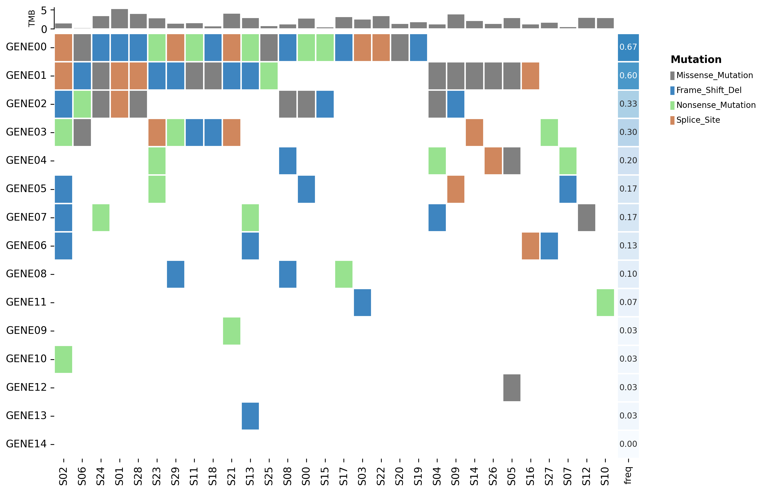
The smallest useful oncoplot is the mutation matrix with a frequency strip and a TMB bar. This runs as-is on the bundled example MAF:
from pymaftools import load_example_maf

maf = load_example_maf("multisample")

table = (
    maf.to_gene_table()
    .add_freq()
    .calculate_tmb(default_capture_size=40)
    .sort_features(by="freq", ascending=False)
    .sort_samples_by_mutations()
)

op = (
    table.plot.oncoplot(figsize=(12, 8))
    .main()                    # the mutation matrix
    .add_bar("TMB", side="top")
    .add_freq(side="right")    # feature_metadata["freq"] as a strip
    .render()
)
op.save("oncoplot.png", dpi=300)
Note
main() registers the matrix but draws nothing on its own — render() is
what lays out and paints every registered track. Call render() exactly
once, last.
Add metadata strips
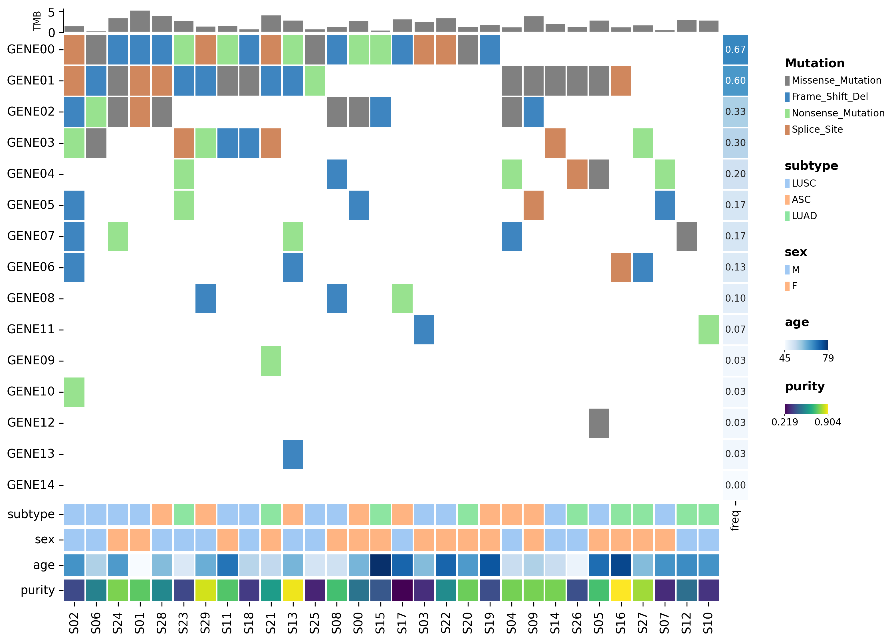
add_sample_annotation draws sample_metadata columns as strips under (or
over) the matrix; add_feature_annotation does the same for
feature_metadata on the row axis. Numeric columns become a colour-mapped
track with a colorbar, categorical columns a discrete colour strip.
op = (
    table.plot.oncoplot(figsize=(13, 9))
    .main()
    .add_bar("TMB", side="top")
    .add_freq(side="right")
    .add_feature_annotation(["pathway"], side="right")          # row strip
    .add_sample_annotation(["subtype", "sex"], side="bottom")   # categorical
    .add_sample_annotation(["age"], side="bottom")              # numeric
    .render()
)
Note
The bundled example MAF has no pathway / subtype / age columns —
this figure comes from a small synthetic cohort. The complete runnable
source (and the other synthetic figures on this page) is
scripts/demo_oncoplot.py:
uv run python scripts/demo_oncoplot.py
Tip
Use add_freq only for 0–1 frequency proportions (shared 0–1 scale). For a
signed per-feature column (e.g. a delta_freq or log2OR), use
add_feature_annotation with a diverging cmap so the scale centres on 0:
.add_feature_annotation(["log2OR"], side="right",
                        cmap_dict={"log2OR": "coolwarm"}, annotate=True)
Group rows and columns
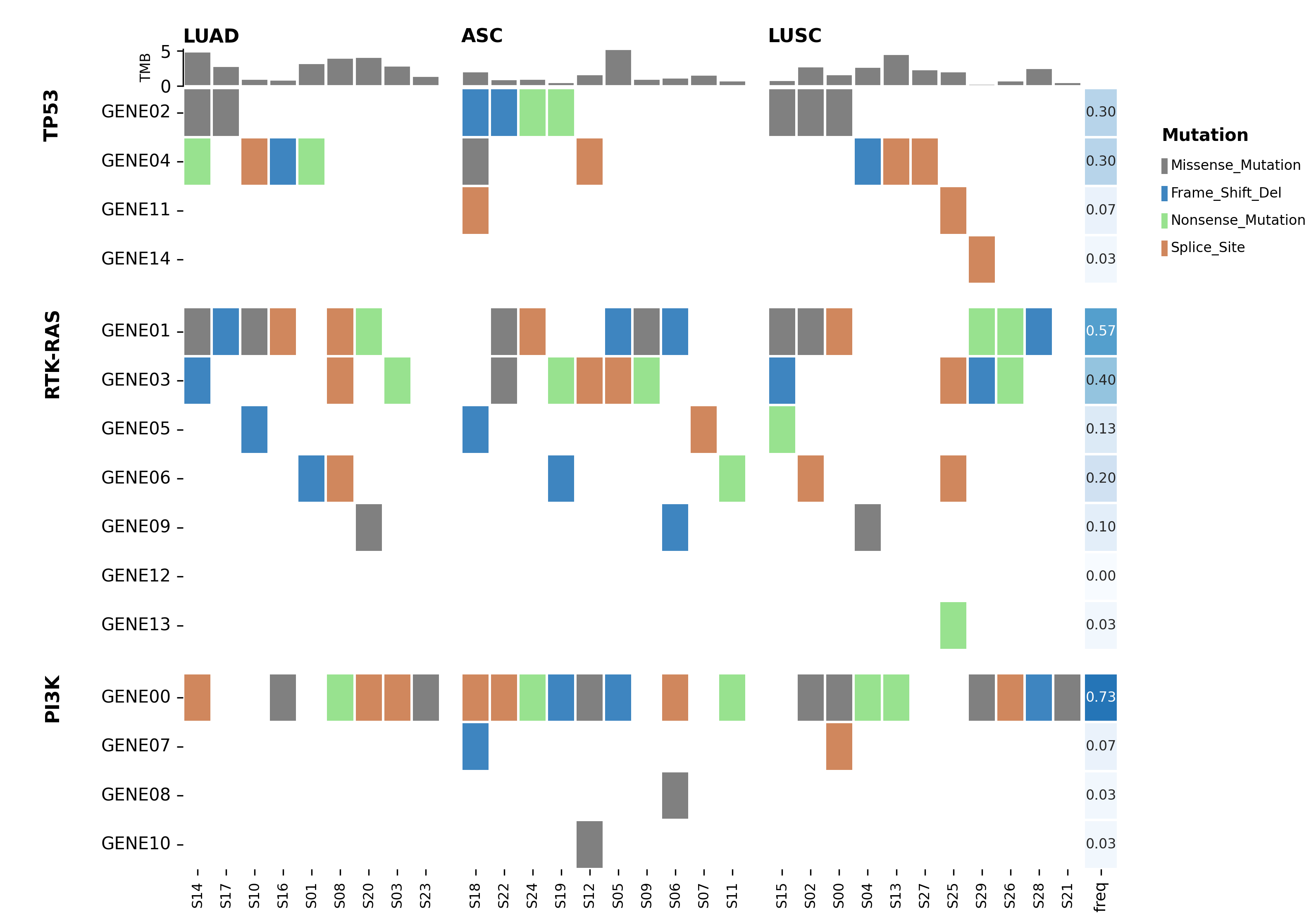
For a comparative oncoplot, section the rows by a feature_metadata category
and the columns by a sample_metadata category. Sort by the grouping key
first so each group is contiguous, then call group_features /
group_samples:
Note
Like the metadata example above, this uses the synthetic pathway /
subtype columns — they are not in the bundled MAF. Run it from
scripts/demo_oncoplot.py, or for a real-data grouped oncoplot on the
bundled HDF5 fixture (which does have subtype) see the capstone below.
grouped = (
    table.add_freq()
    .sort_features(by="pathway")                       # rows contiguous by group
    .sort_samples_by_group(group_col="subtype",
                           group_order=["LUAD", "ASC", "LUSC"], top=10)
)

op = (
    grouped.plot.oncoplot(figsize=(13, 9))
    .main()
    .add_bar("TMB", side="top")
    .add_freq(side="right")
    .group_features(by="pathway")     # row sections + rotated titles
    .group_samples(by="subtype")      # column sections + titles
    .render()
)
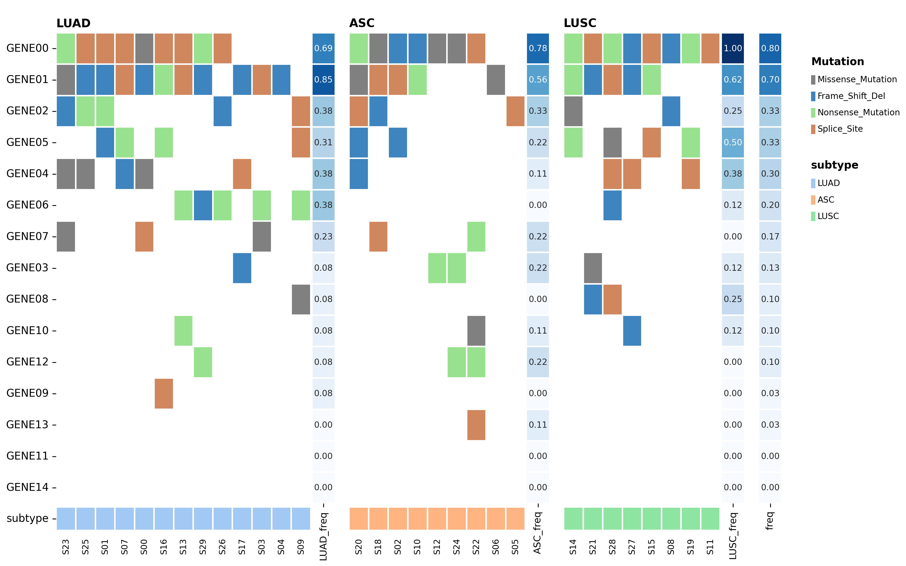
Pass freq=True to group_samples to give each column section its own
frequency strip (LUAD_freq next to the LUAD block, …), populated by
add_freq(group_col=...) or add_freq(groups=...):
.group_samples(by="subtype", freq=True)
Putting it together: a real cohort
Real cohorts are bigger and messier. Plotting everything naively — every gene, every sample, labels forced on — is a useful anti-example:
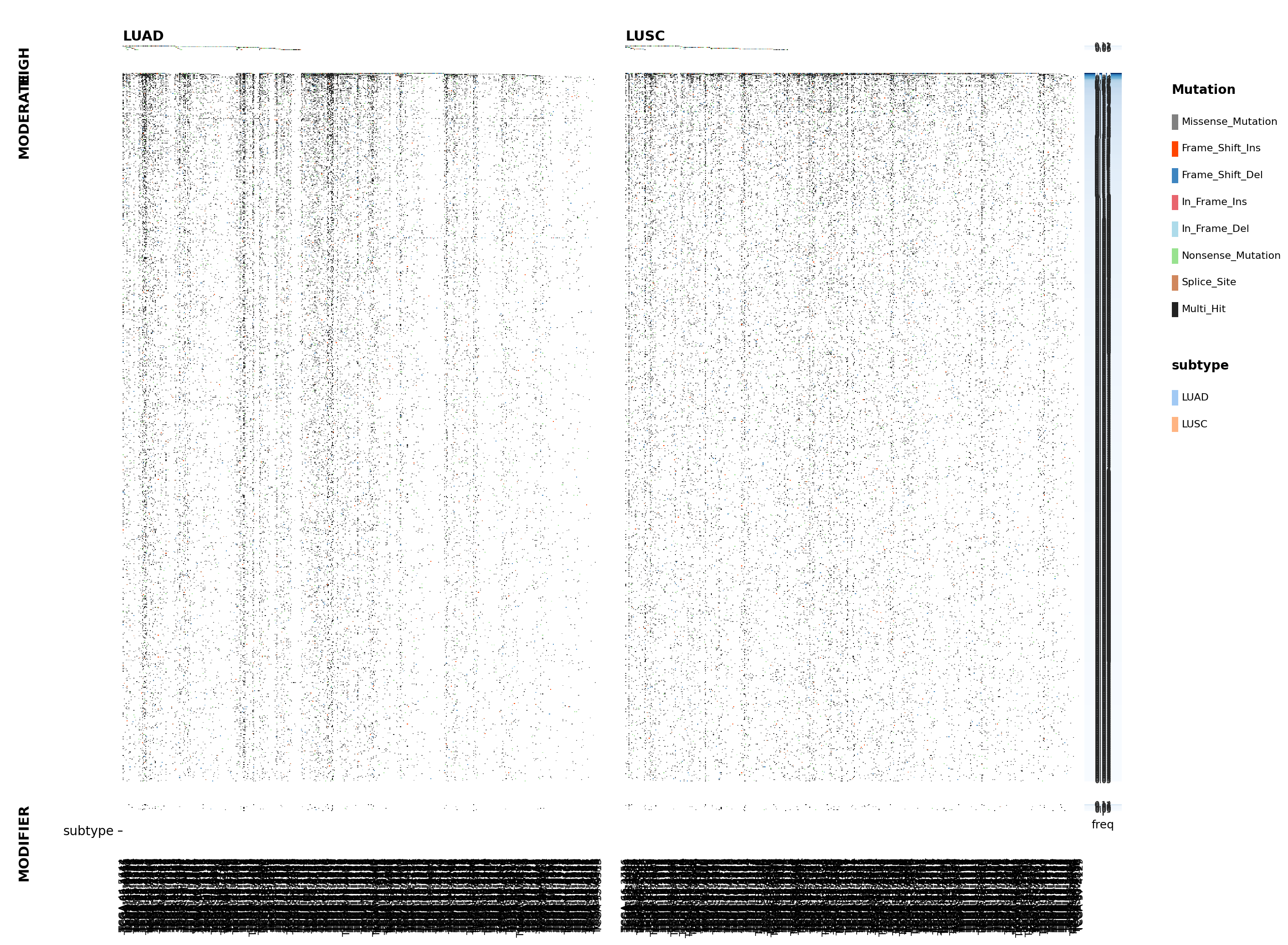
Three things blow up at this scale:
too many genes — rows blur into noise; nothing stands out
sample labels overflow — ~1000 column names collapse into an illegible black band along the bottom
the frequency strips are unreadable — squeezed too thin to annotate
Note
This figure is the full gene table (thousands of genes × 958 samples), shown only to illustrate the failure mode. The bundled fixture below is already distilled to the 62 recurrently-mutated genes, so the runnable code starts one step ahead.
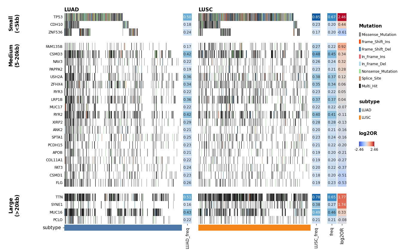
The fixes are exactly the tools from the earlier sections: filter to the
recurrent genes, give the rows meaningful groups (here, exon-size bands), and
let render() auto-hide the per-sample labels once there are too many to
read. The refined capstone bins genes by exon size into row sections, splits
columns by subtype with per-section frequency strips, adds an overall frequency
bar, and a diverging log2OR strip ranking genes by LUAD-vs-LUSC enrichment.
Grouping by size separates the huge “mutated-because-they’re-long” passenger
genes (TTN, MUC16, SYNE1) from compact recurrent drivers (TP53).
import numpy as np
import pandas as pd
from pymaftools import load_example_table

table = load_example_table()

# keep recurrently-mutated genes, look up exon size, bin into bands
genes = table.feature_metadata.index[table.feature_metadata["freq"] >= 0.2]
sub = table.subset(features=genes.tolist()).add_exon_size()
sub.feature_metadata["size_group"] = pd.cut(
    sub.feature_metadata["exon_size"],
    bins=[0, 5000, 20000, 1e12],
    labels=["Small\n(<5kb)", "Medium\n(5-20kb)", "Large\n(>20kb)"],
)

# rank genes within each band by LUSC-vs-LUAD enrichment (Fisher log2 OR)
enr = sub.mutation_enrichment_test(
    group_col="subtype", group1="LUAD", group2="LUSC", method="fisher"
)
c = enr[["LUAD_True", "LUAD_False", "LUSC_True", "LUSC_False"]].astype(float)
luad_odds = (c["LUAD_True"] + 0.5) / (c["LUAD_False"] + 0.5)   # Haldane-corrected
lusc_odds = (c["LUSC_True"] + 0.5) / (c["LUSC_False"] + 0.5)
sub.feature_metadata["log2OR"] = np.log2(lusc_odds / luad_odds).reindex(
    sub.feature_metadata.index
)

# bands contiguous; within each, LUSC-enriched on top
sub = sub.sort_features(by=["size_group", "log2OR"], ascending=[True, False])
n_small = int((sub.feature_metadata["size_group"] == "Small\n(<5kb)").sum())
sub = sub.sort_samples_by_group(
    group_col="subtype", group_order=["LUAD", "LUSC"], top=n_small
)

op = (
    sub.plot.oncoplot(figsize=(15, 9))
    .main(yticklabels=True, linewidths=0)
    .add_freq(side="right", freq_columns=["freq"], annot=True, linewidths=0)
    .add_feature_annotation(["log2OR"], side="right",
                            cmap_dict={"log2OR": "coolwarm"},
                            annotate=True, annotation_font_size=8, linewidths=0)
    .add_sample_annotation(["subtype"], side="bottom",
                           cmap_dict={"subtype": {"LUAD": "#4C78A8",
                                                  "LUSC": "#F58518"}},
                           linewidths=0, size=0.6)
    .group_features(by="size_group")
    .group_samples(by="subtype", freq=True, freq_annot=True)
    .render(wspace=0.03, hspace=0.03)   # sample labels auto-off (958 samples)
)
op.save("oncoplot_exon_size.png", dpi=110)
Note
With ~1000 samples the per-sample column labels are unreadable, so
render() hides them automatically. The full runnable source is
scripts/demo_exon_size_grouping.py (it runs offline — gene sizes are
bundled). See PivotTable for add_exon_size / add_freq details.
For full method signatures and every track option, see the API Reference.